How Different Social Apps Handle Your Attention
Discover how major social platforms approach user attention differently—from infinite scroll to notification design. Learn what they're doing right and wrong.
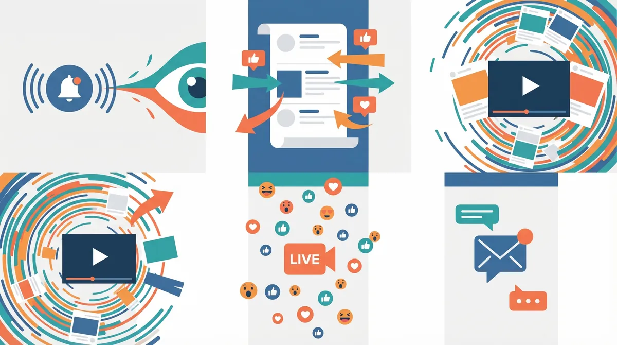
Table of Contents
You open your phone. You're going to check one message. Thirty minutes later, you're scrolling through content you don't remember seeing. You've watched videos you didn't plan to watch. You've been caught in exactly the trap that social apps operate within—and it usually happens by design.
The way apps handle attention reveals something crucial about the platforms we use daily. Some designs encourage us to keep scrolling. Others help us decide when to stop. Some send notifications constantly. Others let us control the pace. These aren't accidents. They're deliberate choices that shape how much time we spend, how often we return, and whether we feel in control of our own experience.
Here's how different platforms approach managing—or encouraging—your attention.
Infinite Scroll Versus Natural Stopping Points
The most visible design choice platforms make is how they present content. Some apps use infinite scroll. When you reach the bottom of your feed, more content automatically loads. There's no end point. There's no moment where you naturally pause and think, "I've caught up."
This approach keeps eyes moving. It reduces friction between content pieces. Users never hit a wall that forces reflection. The feed simply continues endlessly, and the psychological effect is powerful. When there's always more content, it's harder to put the phone down.
Other platforms take a different approach. They show a finite number of posts per session or per day. They include "You've caught up" messages. Some limit feeds to fresh content only, with clear markers between sessions. When you reach the end, you see it. You have a moment to decide whether you want more.
The difference matters more than it seems. Natural stopping points give your brain permission to pause. They create what researchers call "decision moments"—places where you can actually choose whether to continue. Infinite scroll removes those moments. It replaces them with a frictionless experience that flows indefinitely.
Neither approach is neutral. Each one shapes behavior. The question platforms answer is whether they want those decision moments to exist.
How Social Apps and Attention Connect Through Notifications
Notifications are how platforms stay in your pocket. They're the vibration in your pocket, the badge showing unread messages, the alert sound. They're a direct line to your attention from your phone's home screen.
Different platforms use them very differently. Some send notifications frequently—every reply, every like, every share. They fragment your attention throughout the day. Every notification is a small interruption that pulls focus away from whatever you're doing. Multiple notifications create a pattern of switching costs, where your brain constantly context-switches between tasks.
Other platforms hold notifications back. They batch them. They let users set quiet hours. Some only notify when something matches specific criteria the user chose. The frequency and timing differ dramatically. One user might get five notifications an hour. Another might get five a day.
The behavioral effect is measurable. Frequent notifications create habit loops. They train your brain to check your phone reflexively. You start expecting the notification, reaching for your phone preemptively. Some platforms engineer this intentionally—carefully timing notifications to maximize return rates.
Platforms that put users in control ask a different question: What does this person actually want to know right now? That question leads to different notification strategies entirely.
Algorithm-Driven Feeds Versus User-Controlled Feeds
The feed you see is either shown to you by an algorithm or shown to you based on choices you made. This distinction divides how attention flows through social networks.
Algorithmic feeds learn from your behavior. They watch what you click, pause on, like, and share. They use that data to predict what will hold your attention next. The algorithm's goal is engagement—keeping you watching, clicking, returning. It's incredibly effective at finding content that captures interest, partly because it has millions of data points about what does.
But algorithmic feeds also have a side effect. They often show you content designed to provoke reaction. Outrage, frustration, and strong agreement all drive engagement. So algorithmic feeds often amplify emotionally charged content. They learn what keeps you scrolling, and they show you more of it.
User-controlled feeds show you what you choose to follow, usually in chronological order. You see what the people you follow post, in the order they post it. No machine learning involved. No prediction. Just a transparent feed reflecting your own choices.
This changes what you see and when you see it. A chronological feed can't predict engagement. It doesn't know what will hold your attention longest. So it shows you everything equally—and you actually see more posts from people you follow. You're less likely to miss important updates. But you also get less of the platform trying to optimize your behavior.
The trade-off is real. Algorithmic feeds are more engaging because they're designed to be. User-controlled feeds give you more agency because the platform isn't predicting your interests.
Dark Patterns Versus Transparent Design
Dark patterns are design tricks that manipulate behavior. They include features like:
- Preset toggles that are already on (requiring you to turn them off instead of turning them on)
- Confirmation screens that make actions you want easy and actions you don't want difficult
- Fake social proof ("Everyone else is doing this")
- Hidden settings buried under multiple menus
- Language that makes you feel required to act
Transparent design does the opposite. It makes settings visible. It explains why features exist. It asks clear questions instead of nudging you toward choices. It doesn't hide options. It doesn't use psychological pressure.
Platforms using dark patterns get higher engagement. These tricks work. When a platform makes it hard to stop notifications, you get more notifications. When it makes it hard to delete your data, you delete less data. When it resets your privacy settings with each update, more of your information stays public.
Transparent design requires trust. It says: "Here's the control. Here's what it does. What do you want?" That puts the user's preference first, not the platform's engagement metrics.
The choice between dark patterns and transparency reveals what a platform actually believes about its relationship with users. Do they want you in control, or do they want you influenced?
Time Tracking Tools and Time Awareness
Some platforms show you how much time you spend. They send weekly reports. They include daily limits and warnings. They let you set goals. This creates awareness. When you see that you spent ninety minutes in one session, you have information that might change your next decision.
Other platforms don't track time at all. They don't show you. They don't report. You have no built-in awareness of whether your session was five minutes or five hours. The time just passes.
Time awareness changes behavior. Studies show that when people see their usage, they adjust it. Not always, but often enough to matter. Awareness itself is a kind of tool—it's information your brain can use to self-regulate.
But time tracking can also be performative. A platform can show you statistics while still designing the rest of the experience to maximize engagement. Time awareness isn't a substitute for better design. It's a supplement. It works best when paired with features that actually help you stop—like natural stopping points or notification controls.
The most honest approach is time awareness plus the design features that make change possible.
What We Actually Choose
The conversation around apps and attention usually frames it as users versus platforms. But the truth is more nuanced. Platforms make choices. Users make choices. These choices meet.
Some platforms genuinely try to respect attention. They build features that help you stay in control. They don't maximize engagement at all costs. They accept lower numbers because they believe the user experience matters more.
Others prioritize engagement above all else. They use every technique available. They know these techniques work. The ethical question they're answering is whether they should.
The difference becomes visible once you know what to look for. A platform that respects attention shows you when you've caught up. It lets you control notifications. It uses a chronological feed or lets you choose how your feed works. It makes settings visible. It shows you how much time you're spending.
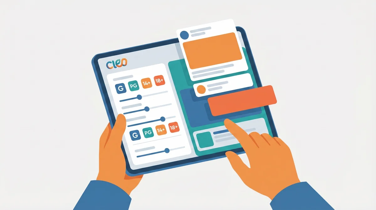
At CleoSocial, we've made specific choices about these five areas. We have natural stopping points built in. We let you control notification frequency completely. We use a user-controlled feed. We've eliminated dark patterns. And we show you your time. These choices mean we might never be the most addictive social app. We're okay with that.
The platforms that respect your attention aren't the ones everyone defaults to. They're the ones you choose because they actually work the way you want. That's a different kind of success—one measured not in total hours spent, but in how people feel about the time they do spend.
The way platforms handle your attention reflects how they think about your time, your agency, and your wellbeing. The question isn't which approach is better in the abstract. It's which approach matches your own values. What matters to you about how you spend time online? That question should drive where you spend your attention.
Understanding Your Own Choices
You can notice these patterns in every app you use. When do you feel in control? When do you feel like the app is controlling you? That feeling is real data. It's telling you something true about how the platform was designed.
If you want to protect your attention, you can:
- Choose platforms with natural stopping points
- Turn off notifications except for what actually matters
- Follow chronological feeds instead of algorithmic ones
- Read your privacy settings and adjust them
- Check time-usage reports regularly
- Switch apps when you notice patterns that bother you
Your attention is valuable. How platforms treat it says a lot about how they treat you.
For more on building healthier digital habits, explore our privacy settings or read more about how we approach social media. If you're interested in how other platforms are approaching these questions, check out recent research from the Center for Humane Technology or studies from MIT on social media's impact on wellbeing.
The platforms we use shape the people we become. Choosing ones that respect your attention isn't a small thing. It's about reclaiming time, focus, and agency in a world designed to take them.
Ready for Social Media That Respects You?
CleoSocial puts you in control. Content ratings, time limits, and real connections. Free to use, always.